Intermediate Graphic Design - Fall 2011
Taught by Associate Professor, Darrell Kincer, this course was an advanced version of the Survey of Computer Art Applications course. Most of the projects were aimed to teach different ways of incorporating non-art elements, such as music or contour objects, to repurpose them into visual art. Other projects required a rebranding of a company's logos and products, much in the same way Matchstic does.
Sound of Art
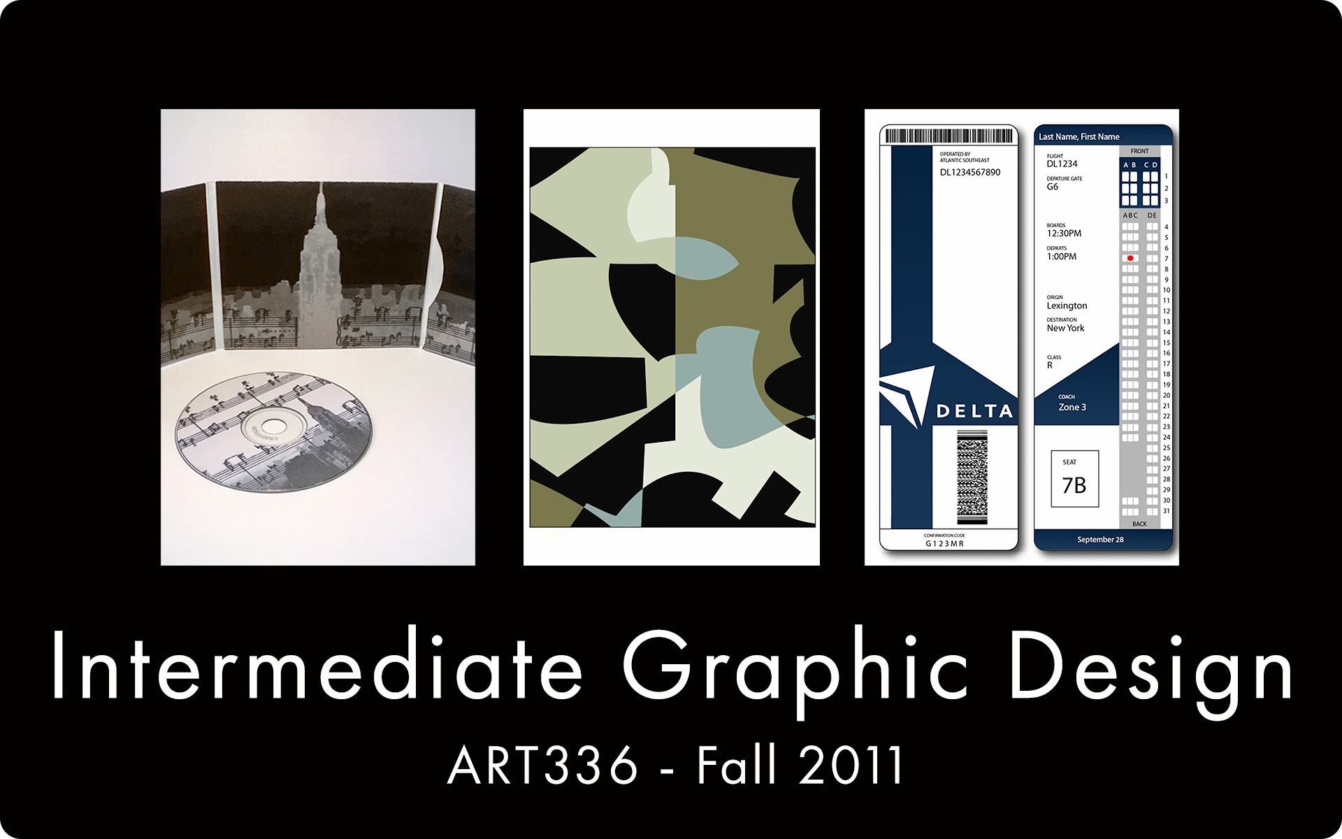
Our first project required us to sample a selection of musical genres and incorporate a visual art design based on the song we chose. Afterwards, we would then design and fabricate a CD case to represent that song. I chose the classical genre, and the song that I sampled reminded me of a black and white NY cityscape, which you can listen to a portion right here:
The song threw me back in time, a time when the Empire State Building was the most magnificent thing ever. The CD case I designed was in greyscale and had a grain-filter to mimic newsprint. In disk had music notes that came from the original artist's music sheet.


Evolution/Revolution
Our next project required us to locate a local business and redo their branding. The "Evolution" required only slight changes while retaining the same assets, while the "Revolution" required a different approach to the original brand, possible by going in a completely different direction and applying personal design. I chose the college's art club, which needed some cleanup to begin with. The second image shows my process of designing a new logo and improving on the original. "Art Docents" was heavily suggested, but it wasn't appealing.


Here are the final versions. The "Evolution" postcard fixed the formatting and cleaned up the unnecessary tiger stripes, and the "Revolution" postcard features a compact logo and professional grey color.


Shapes/Contour
For this project, we used color schemes and abstract shapes as design elements. This image shows lines that we drew on grid paper, and afterwards we traced along the lines and grids to reveal new shapes.
From the shapes that we drew on the grid paper, we match them with a color scheme and describe their "personalities" and the moods they portray. The final step was blending the contour shapes into a new image that overlaps itself. This project helped us learn that interesting graphic designs can originate from simple doodles on paper.


Infographics
For this project, we had to create an infographic poster that was relatable to the art students. I chose to make my poster based on the wonders of the art building. Each of these icons were created with Illustrator's pen tool, a tool I love dearly. Many of these events were from personal experiences and inputs from professors, who had a fun time giving me suggestions. On a side note, one professor used to play a game in which you picked a random tool in the work shop and he had to describe how it could injure/kill you.
Plane Ticket Project
Our final project could be considered as a "Evolution/Revolution" of a plane ticket. Most of the students have never been on a plane, much less seen a plane ticket. As a military child, I flew all the time, so I knew what I wanted to change on my ticket. Visuals were a priority for my design, and when printed out the ticket could be folded into a credit card size format for easy storage.